An outdated tool, an unhappy user base, and a new customer set to design for.
TIR was being introduced to a new set of users, software developers, delivery leads, and managers, who had different use cases from the original user base. The product needed ASV (application/service) and component mapping for each team, which didn't exist.
On top of that: the existing design was non-compliant with ADA and corporate design standards, visually confusing, and had an NPS of −2. I was tasked with a complete design refresh and building new features for the expanded audience.
30–40 interviews. Three personas. One clear focus.
I ran a competitive analysis against tools like Pulse and Workday to identify gaps TIR could fill, particularly around integrated HR-hiring data and richer team information. Then I ran 30–40 empathy interviews across multiple Capital One campuses.
Mid-interviews, I realised most software developers had never used TIR, so I rewrote the interview script on the fly to focus on what they'd need from a registry tool, rather than feedback on the existing one. Better data, better direction.
From the research, I created three distinct personas, each consuming the same data but with completely different jobs to be done:
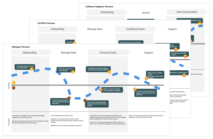
User personas · three distinct jobs-to-be-done
I then mapped each persona to a journey map, surfacing a consistent theme: data management and consumption were the hardest parts. We focused the redesign there.
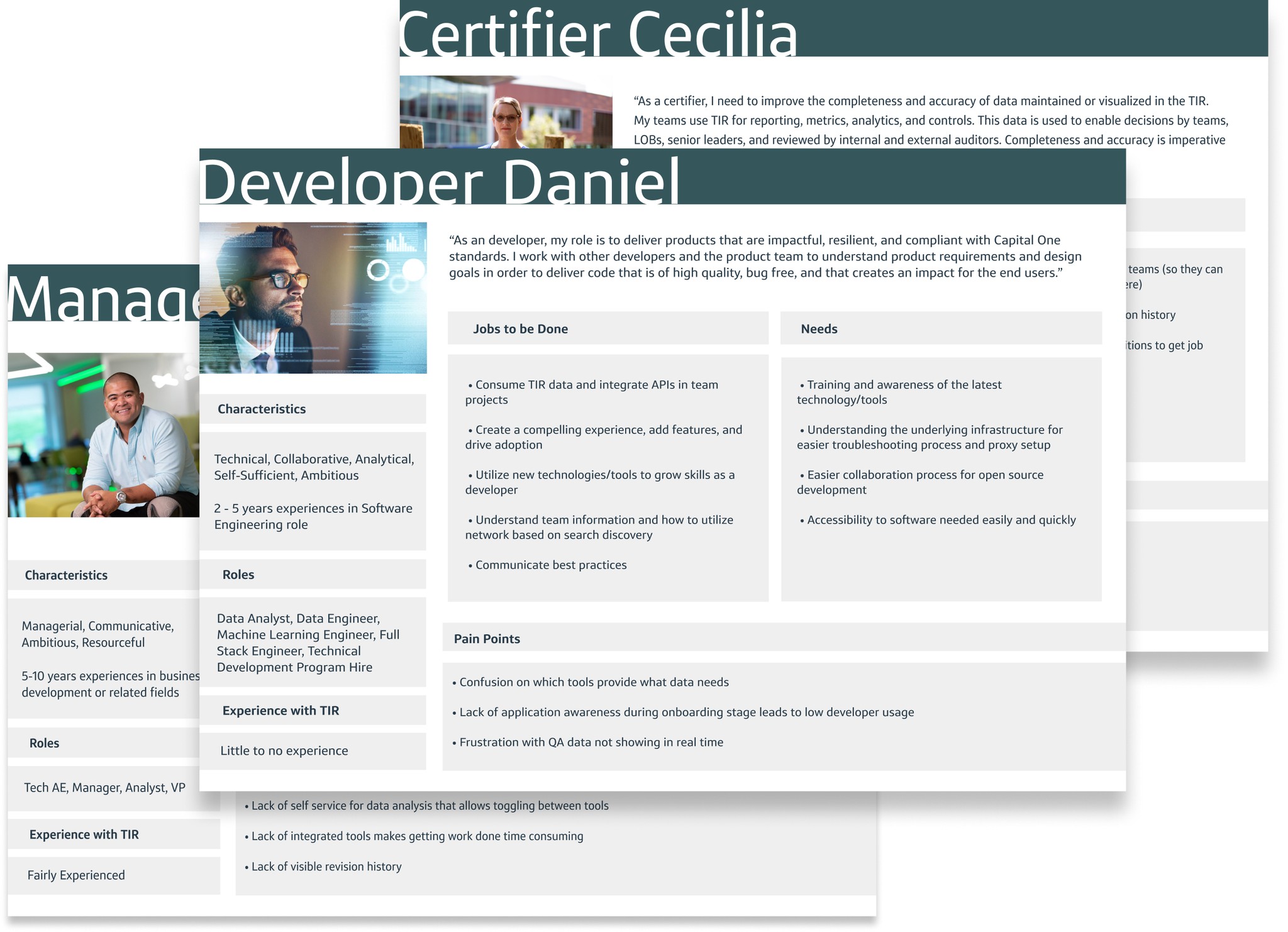
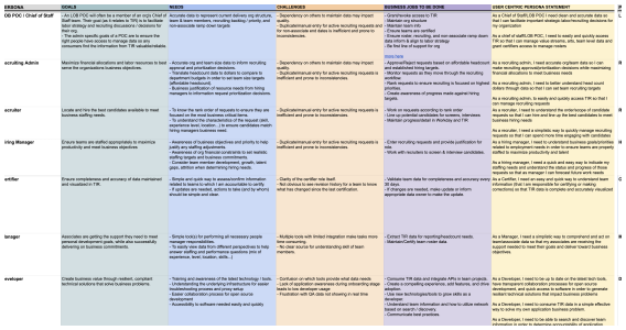
Journey maps · JTBD per persona
Three problems to solve.
Affinity mapping. Then whiteboarding.
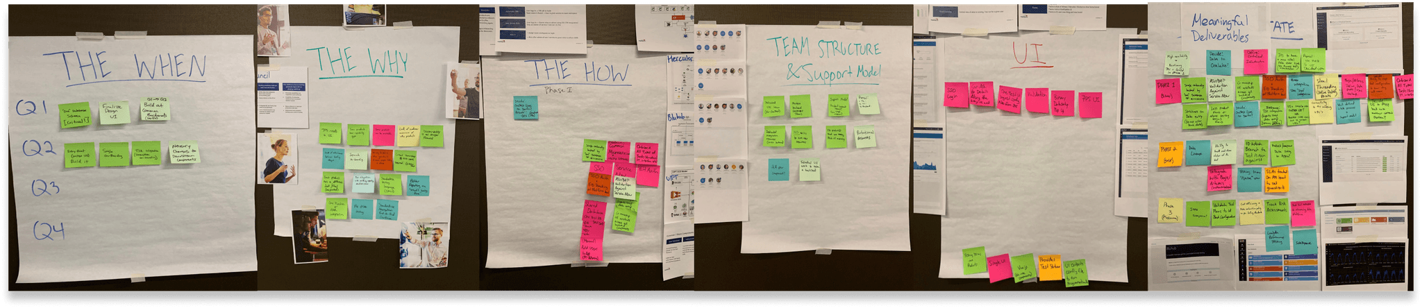
We ran a full-day affinity mapping session, sticky notes, groupings, prioritisation. I kept pulling the team back to scope: the goal was a clean experience with the new ASV component added, within real development constraints. Not a full rebuild.
Affinity mapping · full-day synthesis session
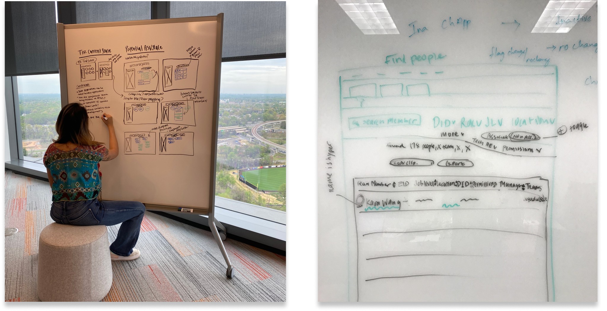
From there I moved to low-fi whiteboarding, keeping top of mind how complex data would be mapped without overwhelming users who just needed to "run in and get out."
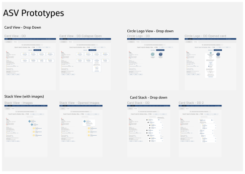
Low-fi wireframes · data-dense views scoped for speed
Two concepts. 15 users. 75% clear winner.
For the new ASV mapping feature, I prototyped two designs, both strong, but with different interaction models. We couldn't agree internally on which made more sense, so we tested with 15 users.
75% preferred Card Style A, it surfaced the right data at the right density. Users said it was faster to consume and more intuitive. The deciding insight: they didn't want to hunt for information, just confirm it quickly.
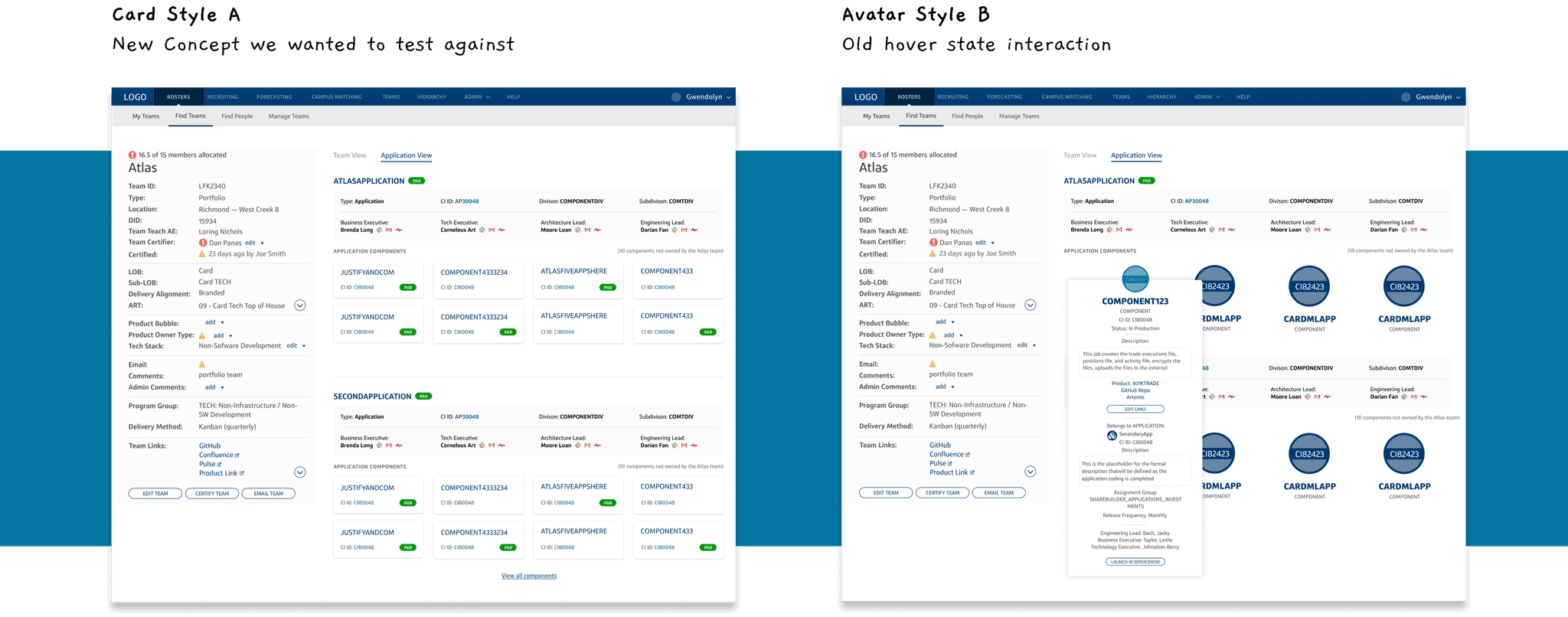
Concept test · 15 users · 75% clear winner
During this process, I also created a structured design delivery process, because design review meetings had become unfocused and endless iterations were consuming the timeline. Formalising the process saved significant time and gave the team a clear path to talking directly to users.
Two key deliverables.
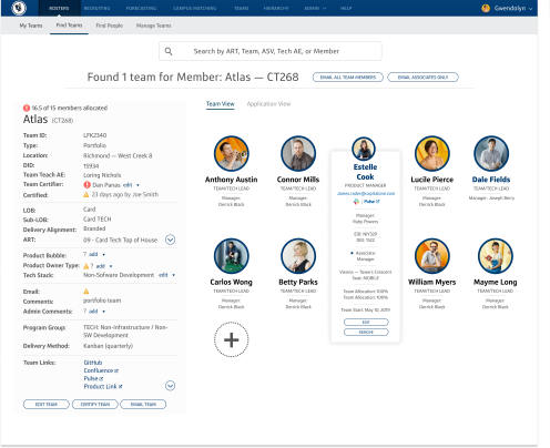
Find member search · table view · scan-ability and speed
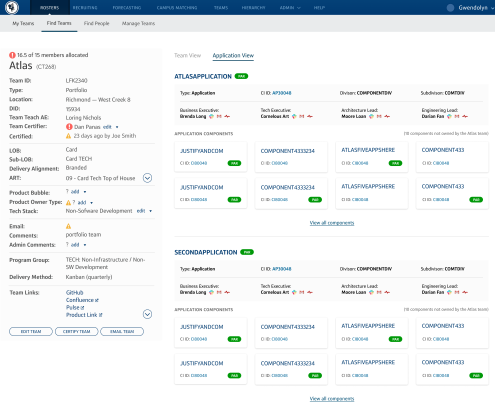
ASV mapping · coordinated with ServiceNow · data fields per persona
NPS −2 to positive. 7,000 users.
From January 2020 to January 2022, NPS went from −2 to positive territory. Unique user sign-ups increased by 3,000 users from 2020 to 2023, reaching a total base of 7,000 associates actively using the tool.
The ADA violations were resolved. The design system was aligned to Gravity standards. And the ASV mapping feature, the #1 request from the new persona set, shipped and worked.
Communication is a design problem too.
Leadership was running ideation sessions in silos, decisions were being made and not communicated, which meant design work was constantly being done against stale briefs. I set up dedicated Slack channels and JIRA workflows to connect leadership, external teams, and the design team in real time.
That shift, treating communication as part of the design system, is what got us to ship. And it's a practice I've taken into every project since.