Users couldn't self-serve. Support was paying the price.
Capital One's internal MFA team had an outdated, ADA non-compliant portal that was failing users at the registration step. People couldn't figure out which MFA option to choose, couldn't distinguish between iconography, and didn't understand the difference between Passwordless and non-Passwordless options.
The result: support channels were flooded. The task was to redesign the portal to drive self-service registration, and nudge users toward the preferred Passwordless option where possible.
Industry audit + existing findings. No formalized research needed.
Prior research had already been done by the MFA team, so I focused my energy on an industry audit, studying how other platforms handled the same challenge. Credit card companies use "bright" banner patterns to nudge users toward preferred options. I applied that mental model to the MFA enrollment flow.
Three core problems from the existing research:
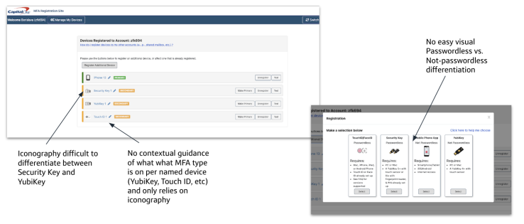
Industry audit · existing research findings
Happy path first. Then iterate on the options split.
I sat with the product team and diagrammed the ideal customer happy path, mapping the MFA selection and registration flow end-to-end. Then we brainstormed UI patterns for how to present the Passwordless vs. non-Passwordless split.
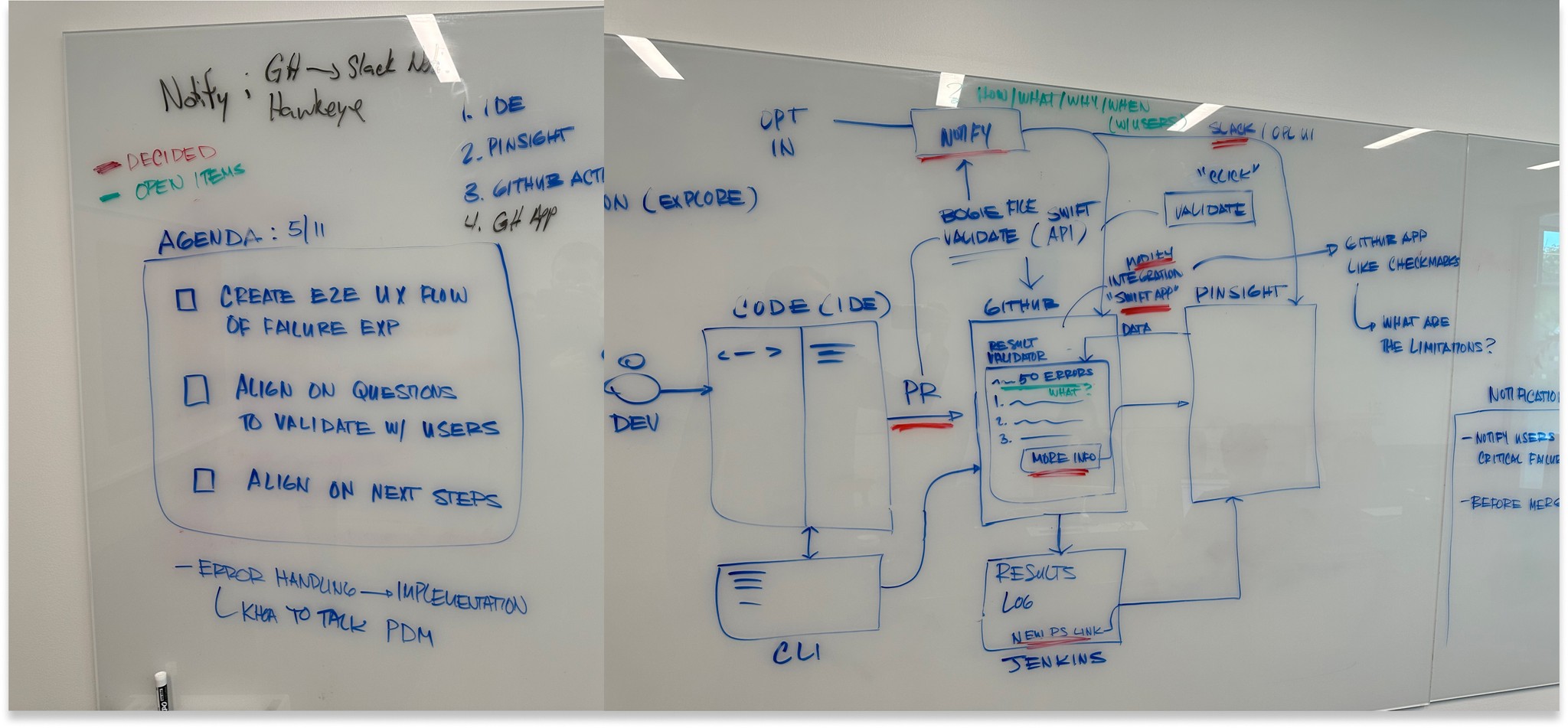
Happy path diagram · MFA selection and registration flow
One early idea: divide options into separate rows with a collapsible for Passwordless requirements. We prototyped it and killed it fast, it added too much cognitive effort to hide and show information. Simplicity won.
ADA compliance + Passwordless nudge + clean UI.
While prototyping, I checked every screen against ADA standards, updating font sizes, color contrast, and iconography to Capital One's Gravity design system. The previous portal had failed on multiple accessibility criteria.
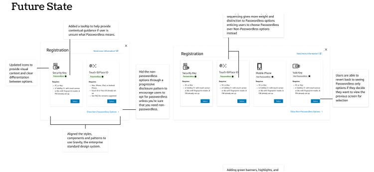
Then came a mid-project curveball: leadership told us Passwordless could no longer be recommended to users for the time being. We redesigned immediately, creating both an MVP state (no Passwordless push) and a future state (with the Passwordless nudge ready to ship when the restriction lifted).
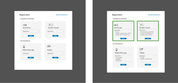
Prototypes · MVP state + future state with Passwordless nudge
10 interviews. Mostly positive. Two real issues found.
We ran 10 usability interviews with power and non-power users, testing against two goals: would users opt for Passwordless, and could they complete registration without support?
With the feedback incorporated, we did a final UI polish and launched.
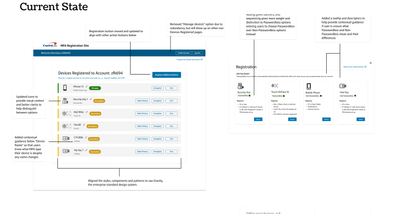
Usability testing · 10 interviews · findings and fixes
Two key screens.
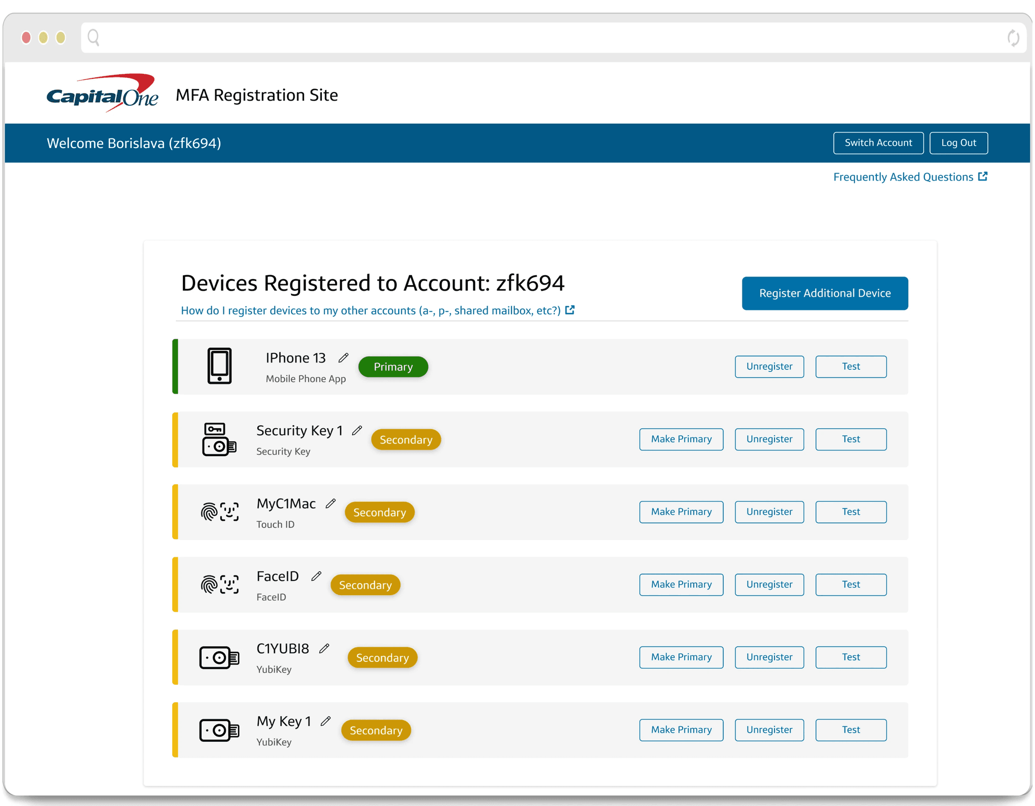
Registration & select device · ADA compliant · Gravity design system
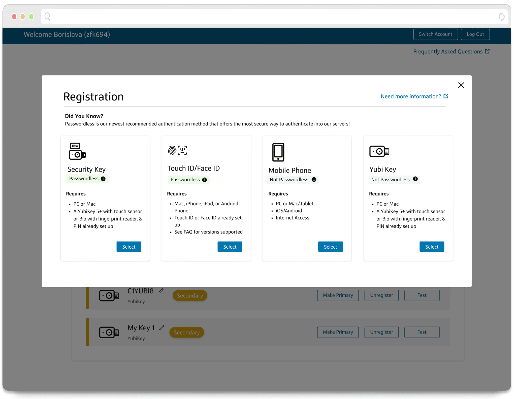
Register new device · Passwordless vs non-Passwordless · future state nudge
60,000 users. 85% on Passwordless. 2–3K per day.
After deployment, MFA registrations hit the goal of 85% of users (60,000) moving to Passwordless, with peaks of 2,000–3,000 people registering per day.
Passwordless registration rate increased 25 percentage points (from 50% to 75%). The support team saw a 10% decrease in Slack questions after launch.
The future state design, with the Passwordless nudge, was ready to flip on the moment the restriction was lifted.
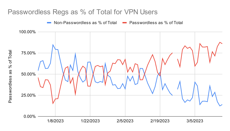
Post-launch · 60,000 users · 85% Passwordless adoption
Design for real constraints. Ship both states.
The mid-project restriction on Passwordless recommendations was a real test of adaptability. Instead of treating it as a blocker, we used it as a forcing function, shipping a clean MVP while keeping the future state ready to activate.
It's a pattern I've used since: design both the thing you can ship now and the thing you want to ship later. Keeps momentum, reduces rework, and gives stakeholders something to point toward.