10 hours a day. In Slack. Answering the same questions.
Internal tech teams at Capital One were fielding hundreds of Slack support requests per day, and every team was building their own chatbot solution independently. Repeated effort, repeated cost, no shared infrastructure.
The opportunity: centralise the chatbot framework into a single platform. Kai, that any team could train, manage, and measure. My job was to make it actually usable, for teams who had never shipped a chatbot before.
20 interviews. Clear pain. Clear direction.
After auditing industry chatbots and existing Capital One tools (including partnering with the Emmi chatbot team to learn from their algorithms), I ran empathy interviews with 20 users across different support teams.
Key finding: teams were averaging 10 hours a day on support channels. Four consistent needs emerged:
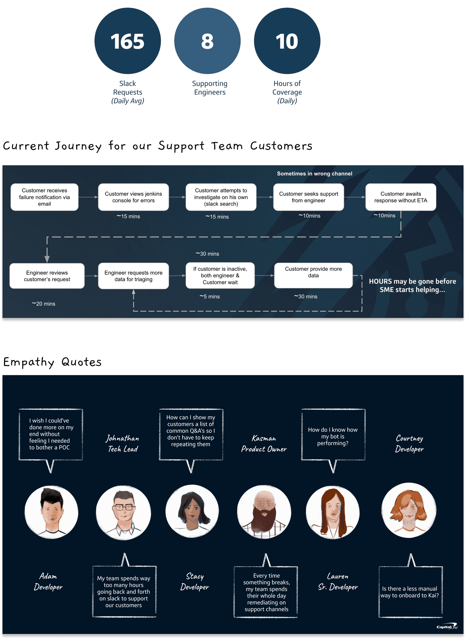
Empathy interviews · 20 users · support team pain points
Mapping the customer, then the system.
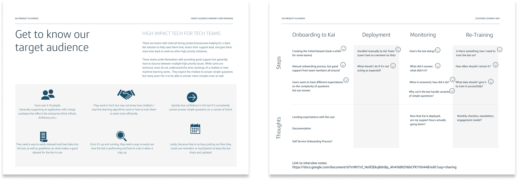
I plotted the journey map for each customer type, the team onboarding their bot, the end user asking a question, to identify where friction was highest. From there I created a process flow showing every decision point a user makes from onboarding through to active bot management.

Customer journey map · onboarding through active bot management

Process flow · onboarding through active bot management
Hothouses, then focus.
We ran multiple hothousing sessions to explore how Kai could expand beyond Slack, widgets, email notifications, SMS alerts. After a group critique, we pulled back: adding more channels would complicate the tool. We refocused on the Slack dashboard experience and one embeddable widget.
The right call. Simpler scope, tighter execution, faster ship.
Four deliverables. One coherent system.
After wireframing the core onboarding and dashboard flows, I moved to hi-fi, responsible for both UX and full creative direction including branding, logo, and iconography.
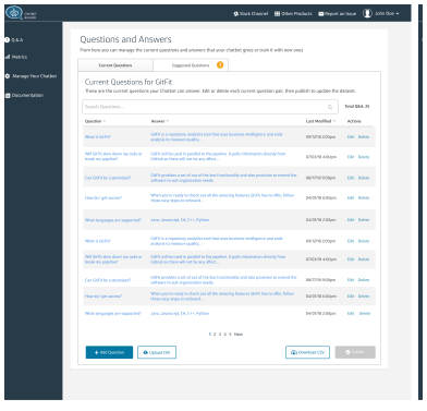
Q&A dashboard · training portal with suggested questions
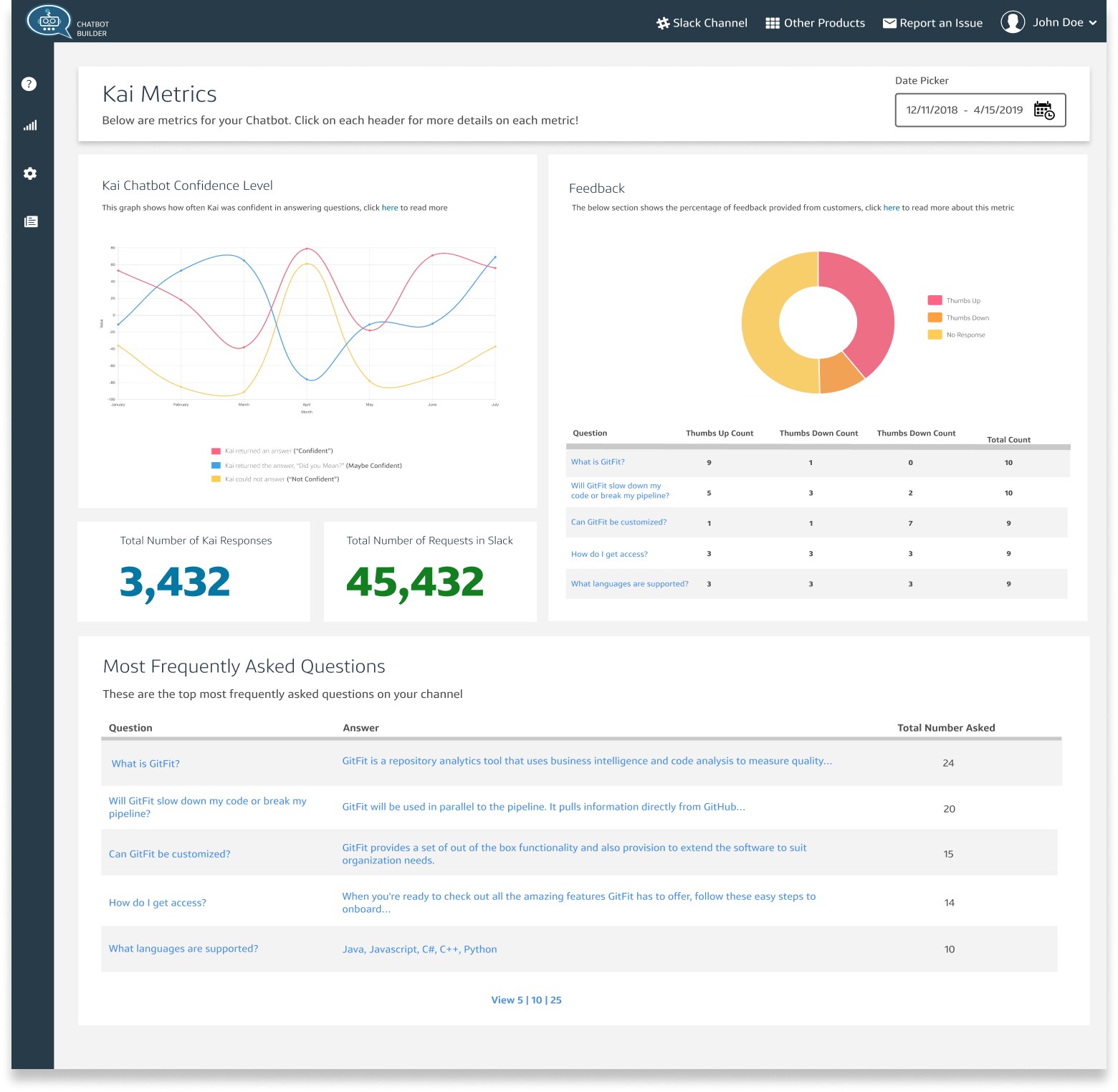
Metrics page · answer rate · usage patterns · performance
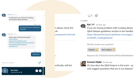
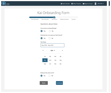
Slackbot + embeddable widget · in-app without leaving the portal
25-user usability test. Real findings. Real fixes.
Task-based usability testing with 25 customers surfaced four specific issues I was able to fix before shipping:
We also demoed Kai at SECON, Capital One's internal engineering trade show, where we did guerrilla interviews with hundreds of engineers and collected survey data. That feedback fed the next onboarding iteration.
−60% support time. Shipped. Measured.
After launch, support time dropped by 60% across teams using Kai. The centralised framework eliminated duplicated bot development across the org. The metrics page, driven entirely by user research, became one of the most-used features.

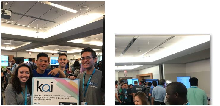
Post-launch · −60% support time · centralised framework live
Bad design in production is expensive.
When I joined, Kai had already been tested in production with 20 users, and the feedback was brutal. No design process had been followed. Users found it visually confusing and missing the features they actually needed.
Starting over was the right call. It taught me how costly it is to skip research and validation up front, and reinforced my belief that the fastest path to shipping good product is doing the user research first.