"We have $500K. Make us look like a company."
Olli Health was a pre-seed startup with a real product (AI-assisted home health coding) and almost no brand. Two co-founders. A demo. A pitch deck. No website. They needed to look real enough to close their next $500K and convince Home Health Agencies to take a pilot call.
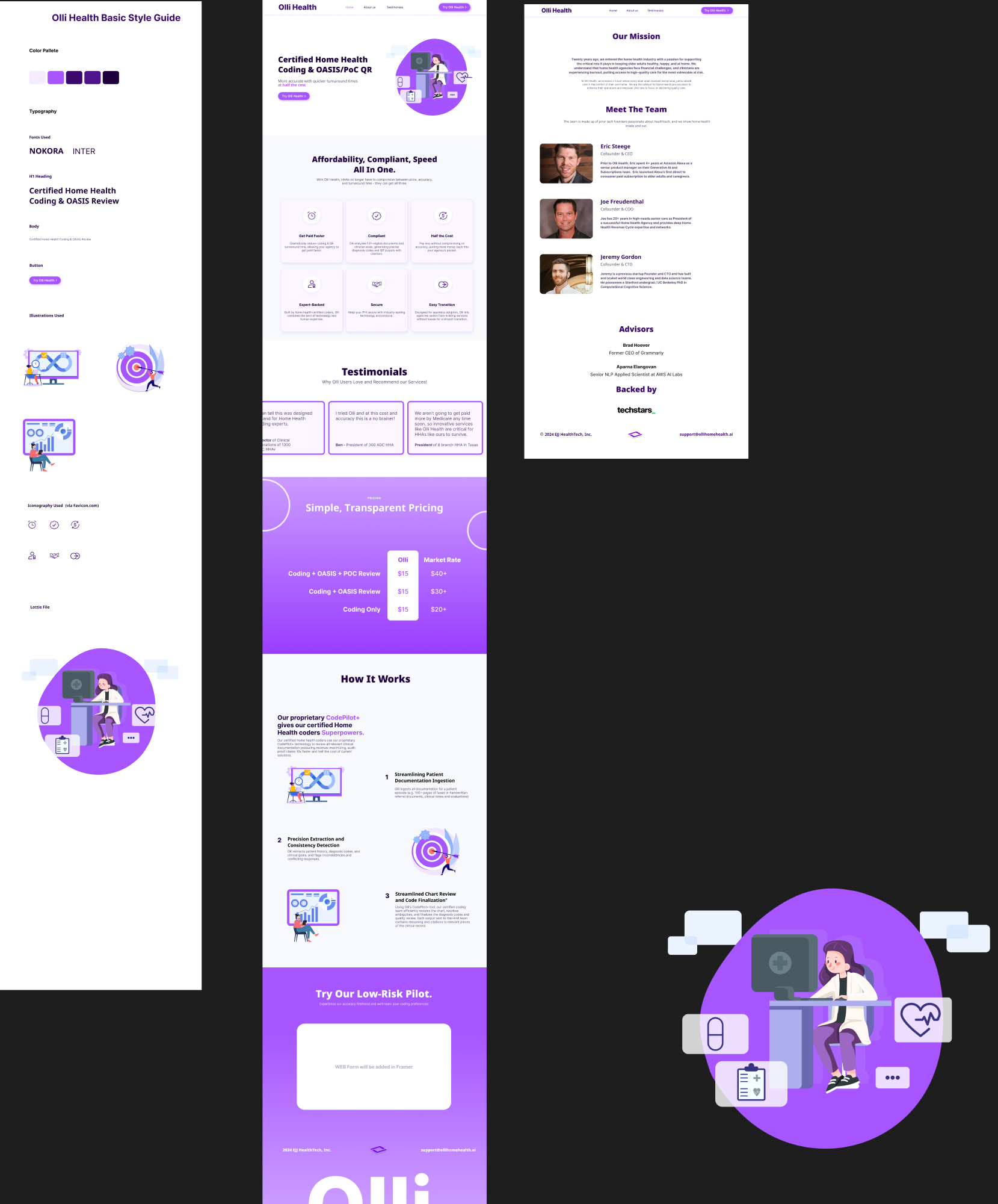
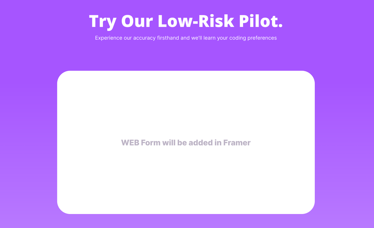
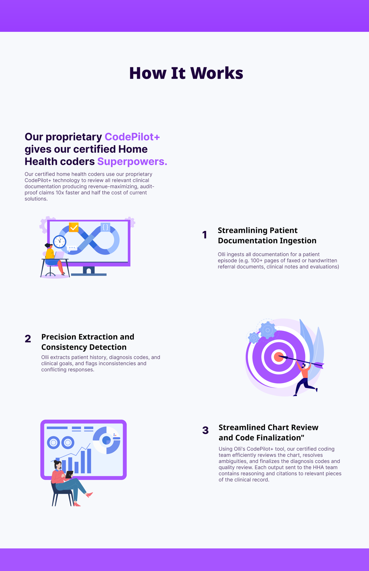
I shipped them a scrappy purple website in Framer, simple sections, mobile-first, testimonials, "how it works." Not award-winning. Not what they'd ship now. But it did the job: closed customers, closed funding, kept them in market.
"The MVP didn't have to be beautiful. It had to be enough to not lose the deal."
"We just raised $10M. We need to look like that."
Three years later, the same founders came back. Different company, same product DNA. 200,000+ patients across 100+ agencies. $10M raised. A team. A roadmap. The 2023 site was actively hurting them in enterprise sales conversations.
The new ask: a complete brand system, logo, voice, color tokens, type, design system, plus a new homepage that reflected what Olli had become. I scoped it as a full rebrand, not a refresh. Refreshes preserve mistakes. Rebrands make new ones, on purpose.
The same product. Two different companies.
The 2023 site is still pinned in the original Figma file. Side by side: scrappy purple MVP on the left, shipped enterprise brand on the right. Same color. Different posture.
- Problem
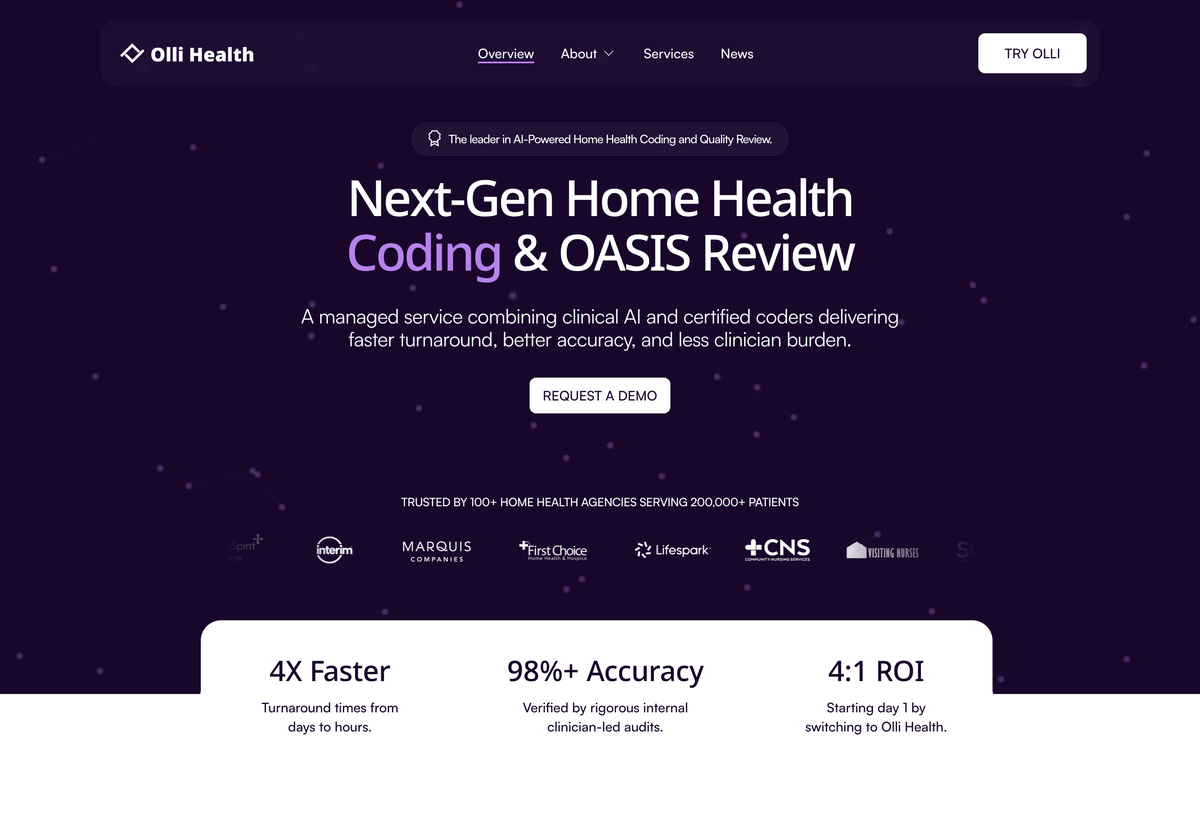
- The 2023 hero sold on price and leaned on a stock clip-art illustration. Fine for pre-seed — but it read "tool," not "platform," the second an enterprise buyer landed on it.
- Approach
- Lead with outcomes, not features. One headline ("Next-Gen Home Health Coding & OASIS Review"), one accent word in lavender, one demo CTA, and a logo cloud of real agencies — set in IBM Plex on Purple 900.
- What it shows
- The numbers are the hero: 4× Faster · 98%+ Accuracy · 4:1 ROI. Same product as 2023; the brand now lets it make an enterprise-grade first impression.
The scrappy site, section by section.
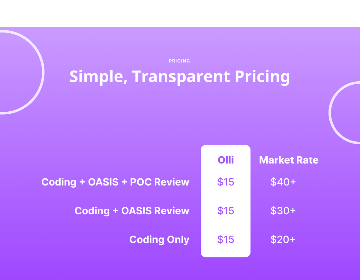
Built solo in Framer on a pre-seed budget: a purple hero, a six-point value grid, social proof, a brutally simple pricing table, and a "how it works" walkthrough of the CodePilot+ engine. Not precious, fast to ship, tuned to do one job — get a Home Health Agency to book the pilot call.
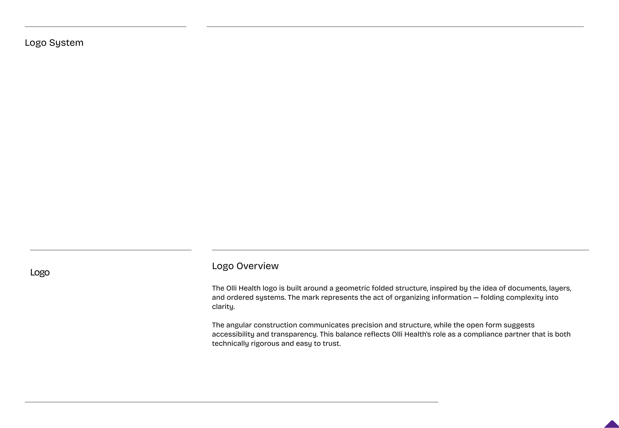
Geometric folded mark. Deep purple. Adult type.
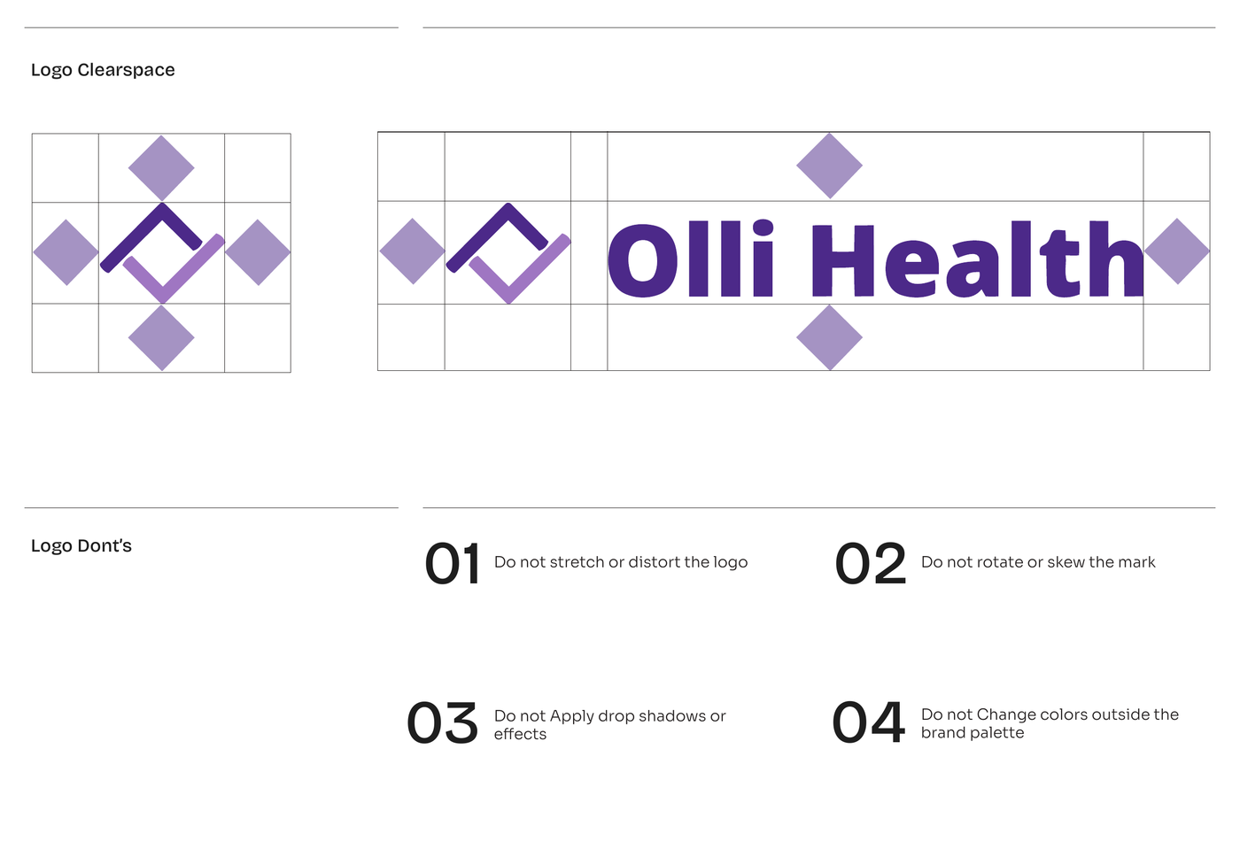
The mark is built around folded geometric structure, inspired by documents, layers, and ordered systems. It's literally the act of organizing information: folding complexity into clarity. Angular precision says "we're technically rigorous." Open form says "we're easy to trust." That's Olli's whole positioning in a logo.
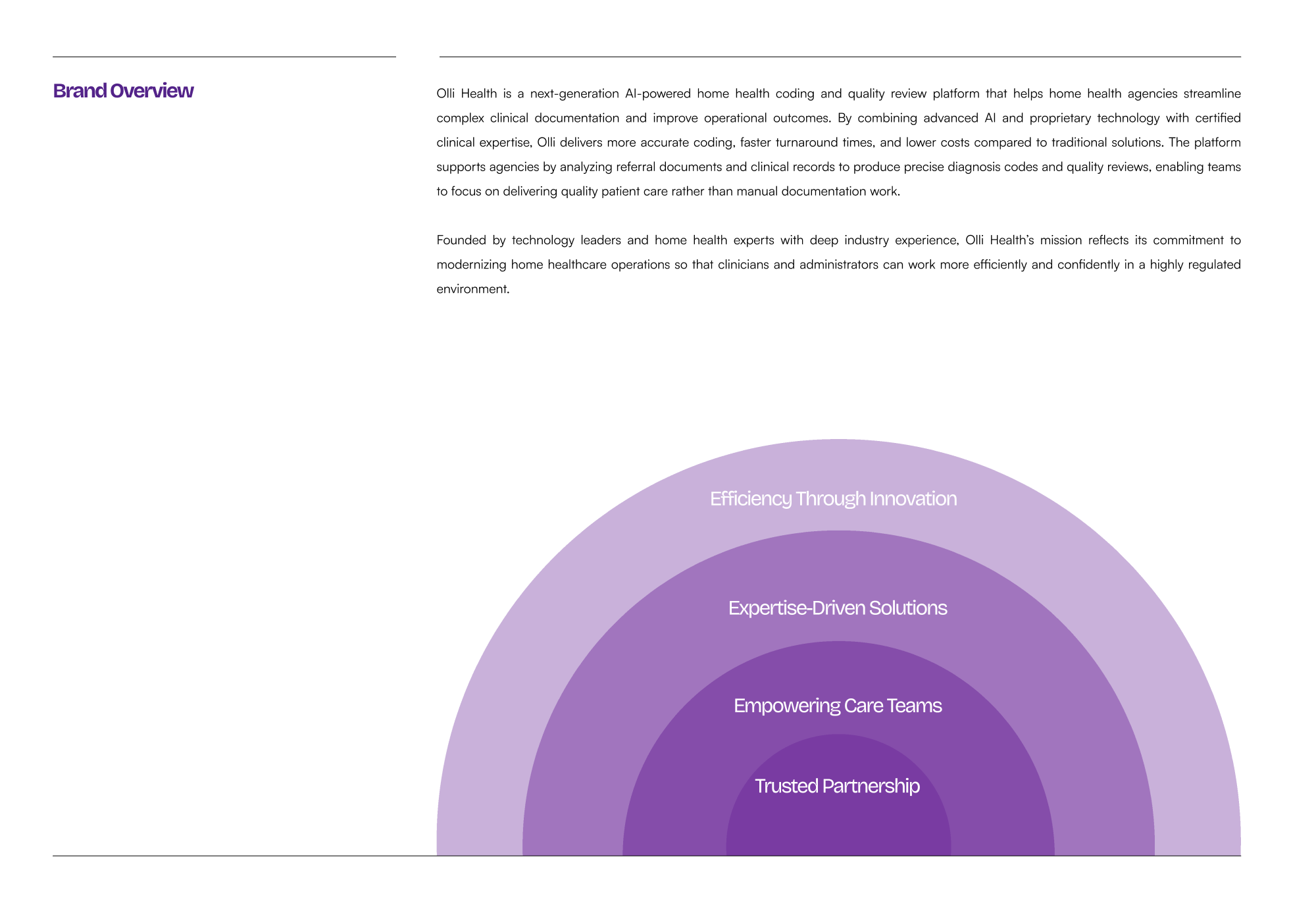
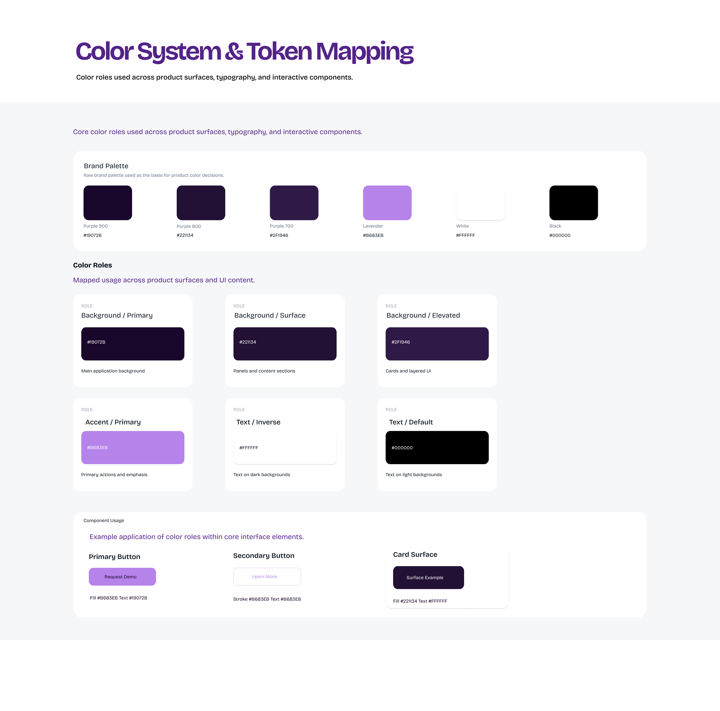
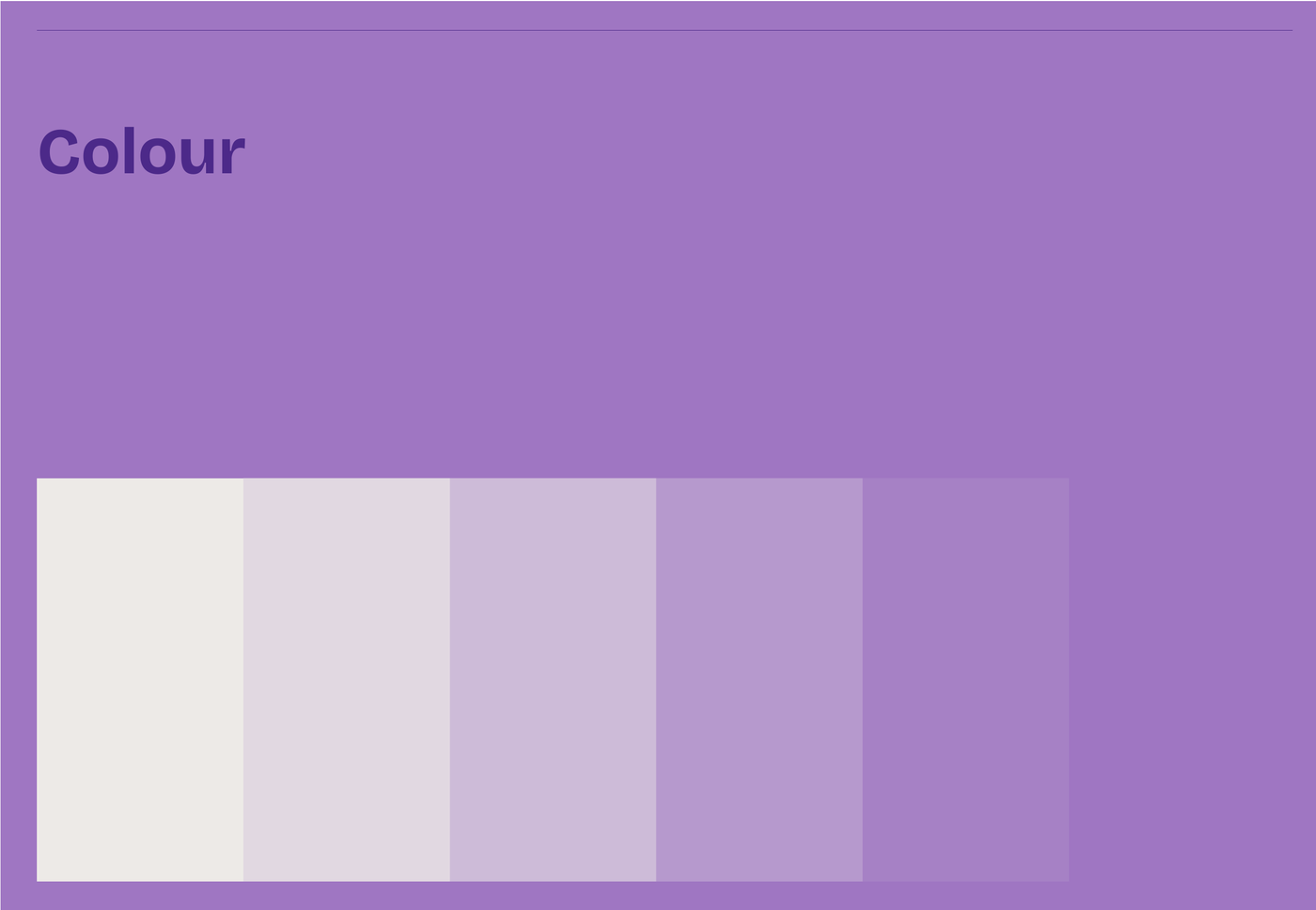
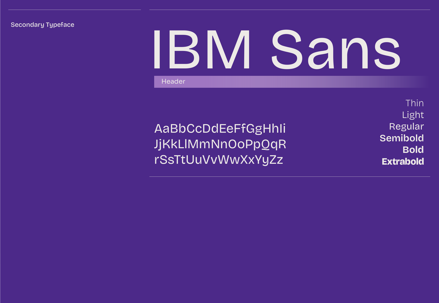
Four purples, one lavender — and a type ladder to match.
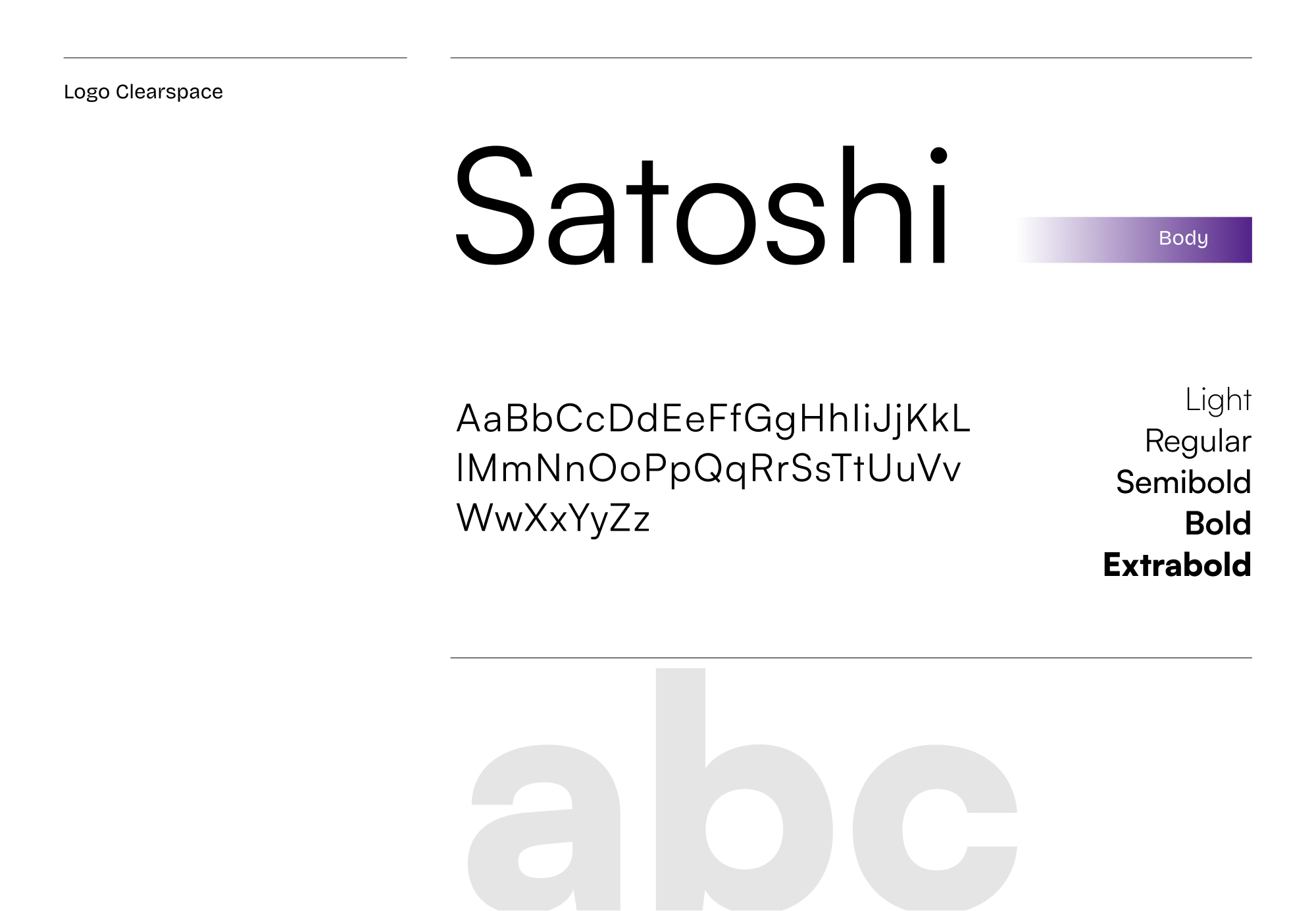
The 2023 site had one purple. Lots of purple. The 2026 system has a stack: Purple 900 for background, 800 for surface, 700 for elevated cards, Lavender 500 as the accent — plus semantic tokens (color-background-primary, color-accent-primary) so engineering implements roles, not hex. On type, IBM Plex Sans carries the headers — institutional, exact, healthcare-credible — and Satoshi the body: modern, geometric, legible at small sizes. Serious tech, not Goop-for-clinicians.
18 pages the team can't argue with.
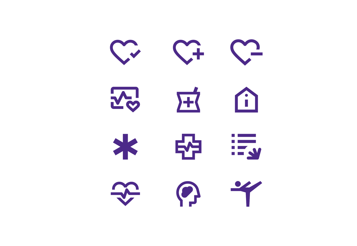
Everything above ships as one brand guidelines deck — the document that lets Olli's team and any future vendor apply the brand without me in the room. Logo construction and clearspace, the Satoshi + IBM Plex ladder, the purple token stack, an ownable pattern system, and a full geometric icon set. Built so the brand survives contact with people who aren't the designer.


The decisions that took it from MVP to enterprise.
Shipped. Live. Selling.
The new brand is live at ollihomehealth.ai. The system is documented in Figma with brand guidelines, logo rules, color tokens, type ladder, do-not-distort, semantic mapping. The actual test of a brand isn't whether it looks good, it's whether the team can use it without me. They have.
I rebuilt the homepage as the argument, not the decoration. Every section had to carry a job from the sales conversation — and prove the rebrand decisions held up under real content, not just a Figma mockup. Here's what shipped, and what each screen is doing.
- Problem
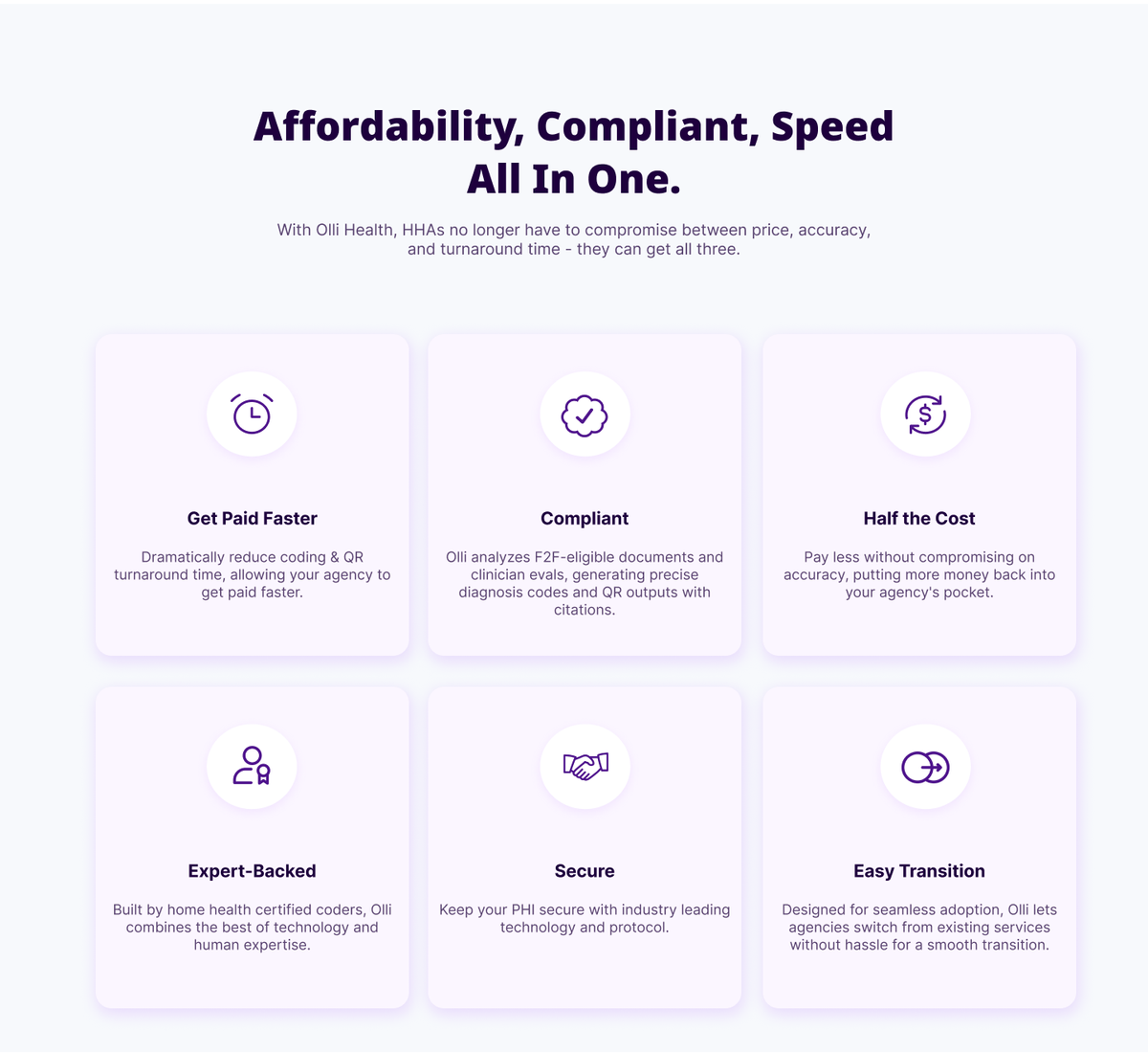
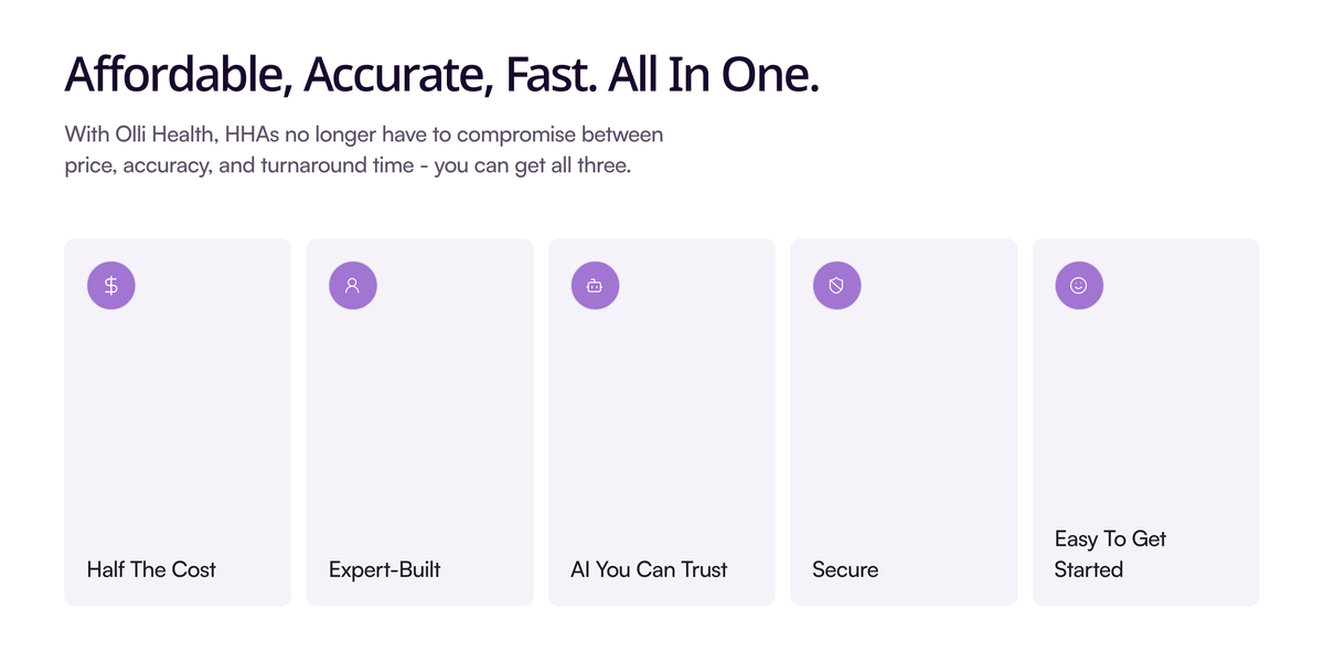
- 2023 had the right proof points buried in six flat cards with clip-art icons. The argument was there; the authority wasn't.
- Approach
- Rebuild the same claims as a disciplined card grid — geometric iconography, the single type ladder, generous spacing. Killed every stock photo.
- What it shows
- Continuity on purpose. Half the Cost · Expert-Built · AI You Can Trust · Secure · Easy to Get Started — the MVP's pitch, now wearing the enterprise system.
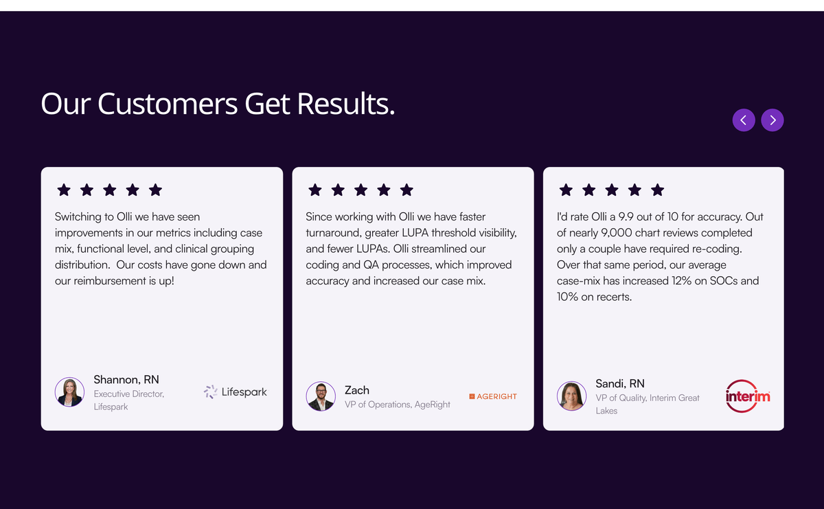
- Problem
- Pre-seed had testimonials but no credibility scaffolding — quotes floating without faces, titles, or outcomes.
- Approach
- Treat social proof as a component: named clinicians, photos, agency, one concrete result per quote, on the brand's dark-purple surface.
- What it shows
- The "we don't replace coders, we give them superpowers" voice — validated by the coders themselves. Trust a buyer can forward to procurement.
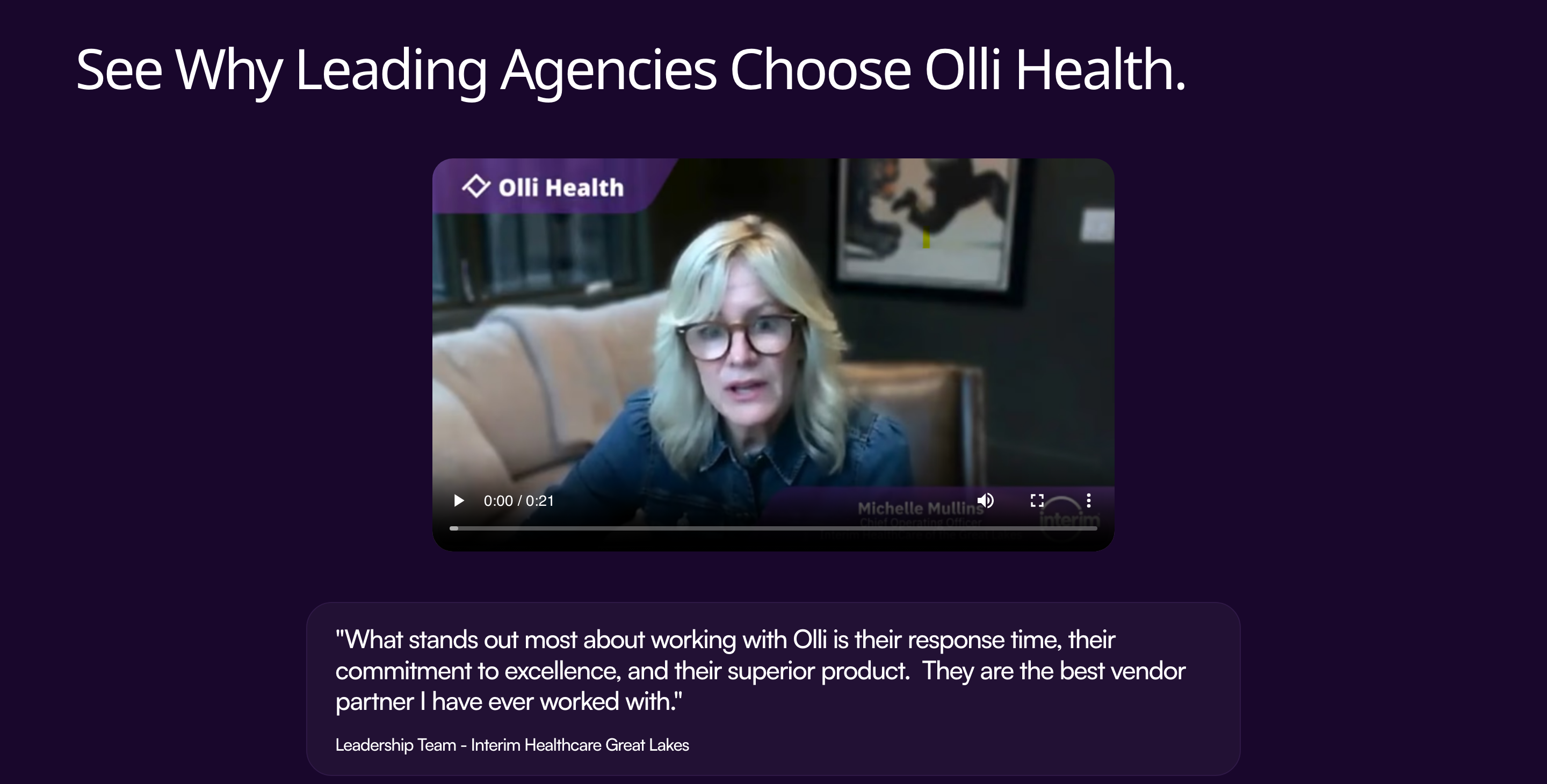
- Problem
- Written quotes are easy to skim past. A managed-service pitch lives or dies on whether a buyer believes a human, not a testimonial card, said it.
- Approach
- Slot a real client video straight into the system — same purple frame, same wordmark, same type — so it reads as part of the product story, not a bolted-on marketing widget.
- What it shows
- The brand holds up on video, not just static comps. That's the harder test.
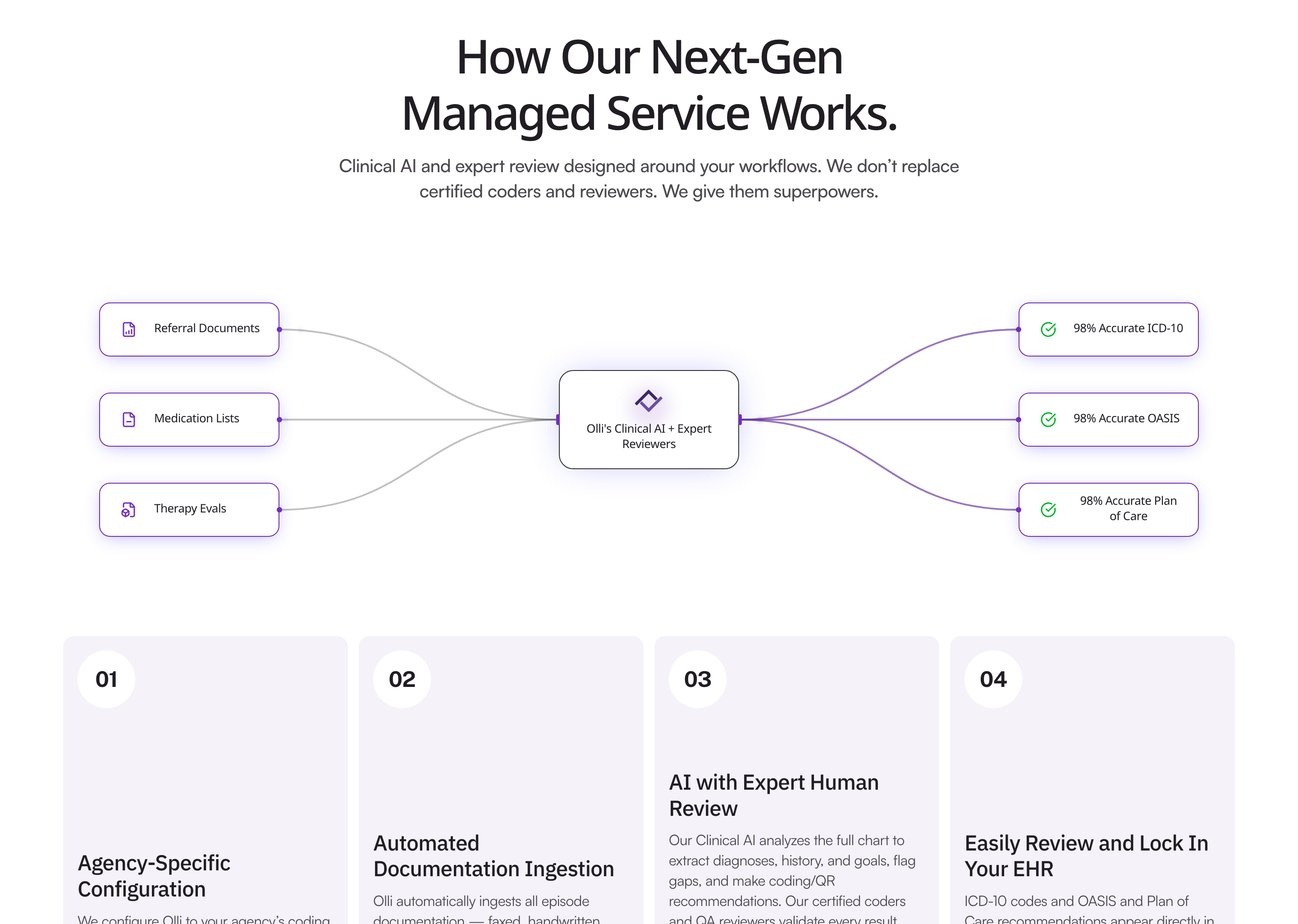
- Problem
- "AI-powered coding" is a claim every competitor makes. Without a visible mechanism, it's marketing, not proof.
- Approach
- Diagram the actual pipeline — inputs → Olli's Clinical AI + Expert Reviewers → accuracy outputs — then back it with four concrete process steps (agency-specific configuration, automated ingestion, AI with expert human review, EHR lock-in).
- What it shows
- Specificity is the sell. A buyer can trace exactly what happens to their documents before they hand any over.
And the bigger metric: they hired me twice. Three years apart. Same project category, different stakes. That's the model I want more of, be the designer founders come back to when they grow up.
The 2023 site lasted 3 years past its sell-by date. I should have built it with more headroom for growth, even at pre-seed, leaving room to scale a brand system in is cheaper than rebuilding it. I also under-charged for v1 because the team was scrappy and broke; I'd price the rebrand option into the original engagement so they have the framework ready when they hit their next round. Both are operator lessons, not design lessons.