Multi-Factor
Authentication
Multi-factor authentication (MFA) is a security process in which a user provides two or more independent forms of identification, called factors, to prove one’s identity.
UI design
UX research
Service design
Internal Tooling
About
Problem & Scope
The Capital One internal MFA team had been struggling with users being unable to self service registration of their new multi-factor devices in their current portal. Our support channel was having to spend countless hours walking new users through registration due to confusion.
The task was to redesign an outdated, non-compliant application with corporate design standards.
My Role
I was a UX designer and UX design lead.
I worked with a design team, tech lead, and product owner at Capital One Bank.
Research
Discovery
I looked into how industry practices were conducted throughout other websites to fulfill the same outcomes I was hoping to achieve (i.e credit card companies often display “bright” banners signaling a special offer/promotion that attract users to select preferred options).
Problems Uncovered
I did not conduct formalized empathy research as it was done prior for me but essentially the MFA team discovered that users were unaware of what MFA options currently existed, had issues visually discerning between iconography, and unaware of the difference between Passwordless vs. Non Password options.

Ideation
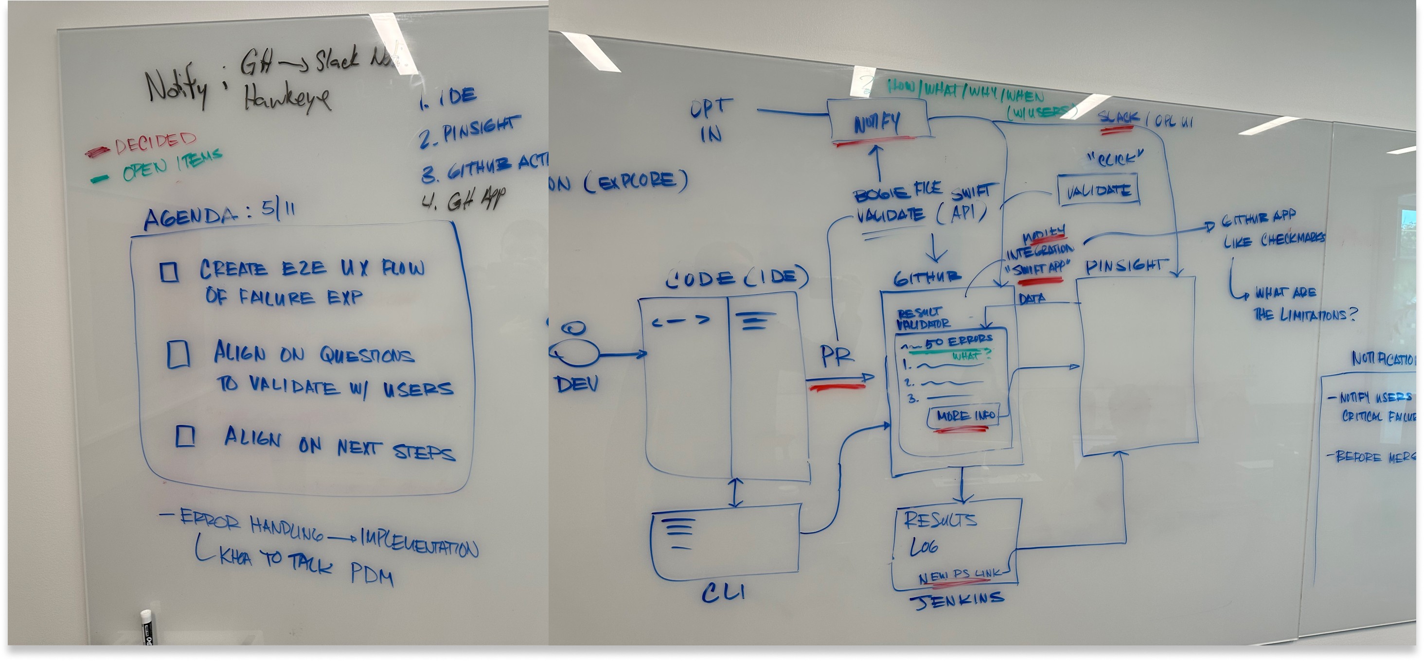
We sat with our product team and diagrammed potential solutions we could see our customer happy paths leading to. Here – we brainstormed on some different UI sequencing that would make sense for users to visualize different options and threw together a bunch of different iconography solutions.
Drawing the happy path diagram for our MFA solution
Prototyping
While prototyping some different outcomes, to entice users to select Passwordless options, I tried to divide options into separate rows and add a collapsible that only displays Passwordless requirements.
Collapsibles in this context felt like it added too much human effort to hide and show information – we quickly scrapped the idea.
During our prototyping, we also made sure to check for ADA compliance and brush up font/color and iconography to our Capital One Gravity Standards

Changes in Requirements
As most things in development never go to plan, during the middle of testing and prototyping we were told by leadership that current state could no longer recommend users to opt for Passwordless for the time being. We decided to then offer an MVP state and a future state design.


High-Fidelity Designs
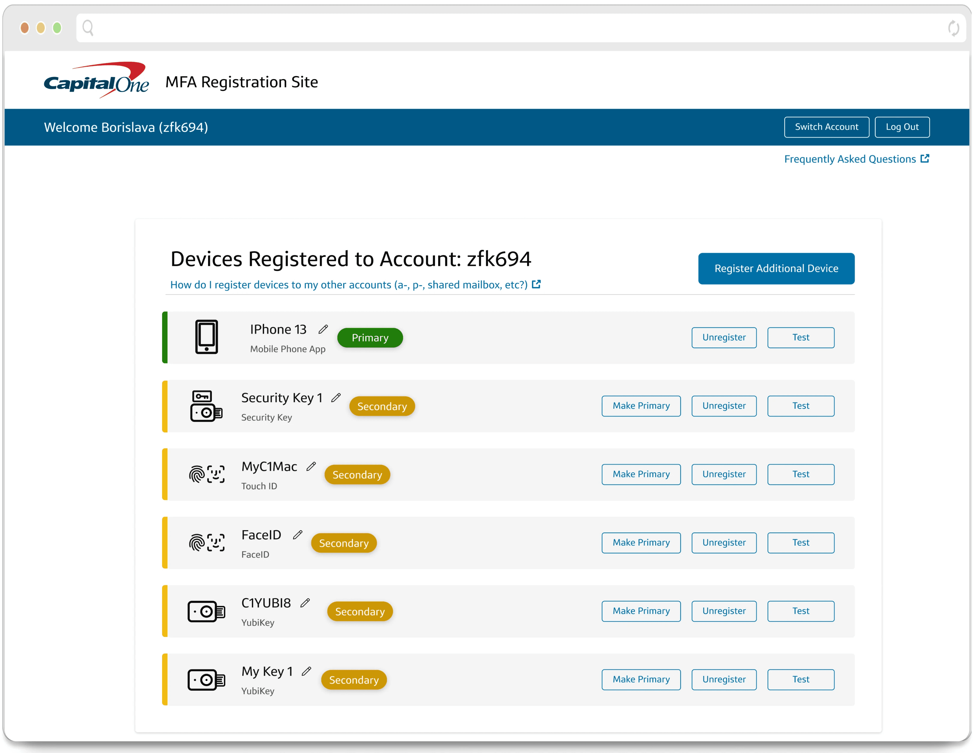
Registration and Select Device
After testing a few different registration screens, we kept our original UI formatting because users had become so accustomed to it that some of our new test screens were seen initially confusing and out of user mental models. Our Iconography and overall UX clean up solved many user complaints and confusions.

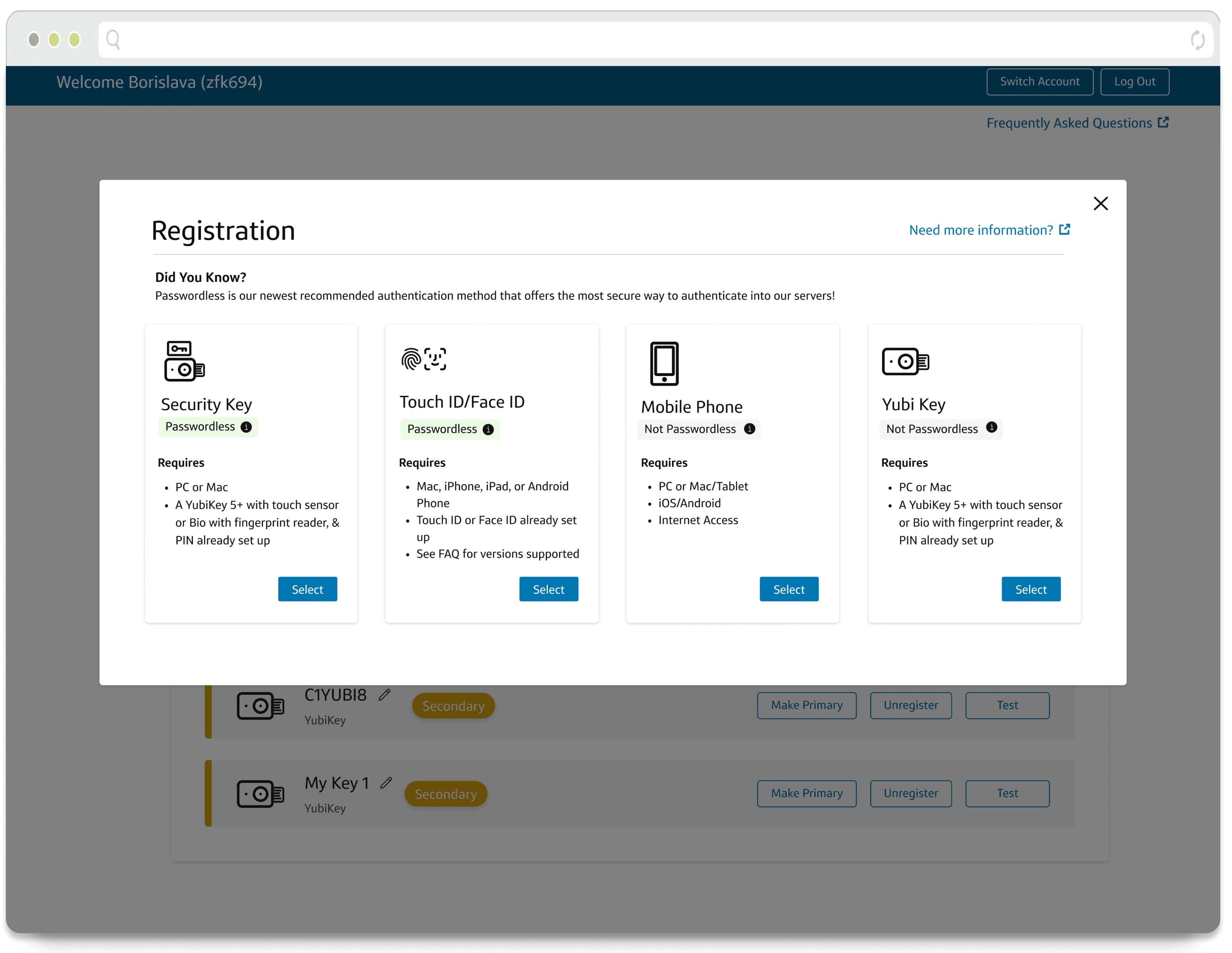
Register a New Device
This Register a New Device screen was selected over 80% of the time above other options. It gives more clarity into the differentiation between Passwordless vs. Non Passwordless options and additional context between each device. It gives a light "nudge" into choosing the preferred method of Passwordless for our first MVP launch.
Results
After deployment of our new designs:
MFA registrations hit their goal of 85% of users (60,000) onto Passwordless, with sometimes 2,000 or 3,000 people were registering a day sometimes
Data collected showed that there was a 15% increase (from 50% to 75%) of users that registered for Passwordless devices
The support team saw a 10% decrease in slack questions being asked after our launch
